Rethinking the Modern Aspect Ratio: Why More Filmmakers Should Think ‘Inside the Box’
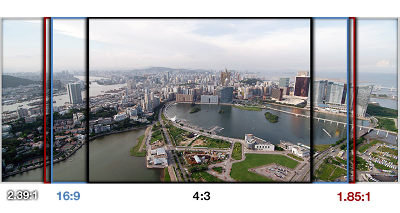
Besides the buttery, tactile crunch of lobby popcorn and the sunken silhouettes of ill-tempered Millennials thumbing out texts, what comes to mind when you think of the theatrical movie-going experience? Picture the screen itself. What shape is it? Chances are you’re envisioning a long rectangle—likely the 1.85:1 anamorphic widescreen image, roughly proportional to the dimensions of a box of delicious Mike & Ike’s gelatin candy. And unless your TV is old enough to buy cigarettes, your television is probably the same shape as well.
Obviously it wasn’t always like this. For 50 or so years of its existence, cinema hewed to a standard 35mm 4:3 “Academy” picture image—not perfectly square, but close enough to pass for one in a police lineup. Hardly anyone uses 4:3 for features anymore, preferring widescreen’s ability to accommodate epic vistas and intricate horizontal compositions. But maybe it’s a mistake to ignore 4:3. Maybe it’s time for filmmakers to start thinking inside the box.

Look, I’m not a mechanical engineer or adjunct professor of cinema history. I couldn’t tell a Lumiere camera apart from a picnic basket, and in general my knowledge of cinematography only extends as far as deciding which Instagram filter makes my cat look the most punk. There’s an amazing article from the British Film Institute that explains the history of the movie frame and why it evolved the way it did, but basically it all boils down to sprocket holes and the studio system’s panicked, midcentury attempts to compete with television.
But I’m not here to argue that 1.85 is wrong or bad. It’s obviously not. I’m just arguing that it just shouldn’t be the default. Here’s why:
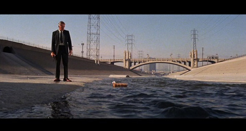
The square image literally and figuratively reframes your focus. Unless you’re filming the music video for Des’Ree’s “You Gotta Be” against a white infinity background, the most immediate piece of information gleaned from staring at a single frame of celluloid is a character’s relationship to her or his environment. Widescreen frames emphasize Character as a landscape detail—albeit the one our eyes are most drawn to, as human beings with an inherent human-centered bias. But even when the camera tracks to follow a character’s movement, it’s still just photographing space. To an alien brain, the two-dimensional image of a human moving screen-left to screen-right with a tracking camera is still just light and motion, no different than a stationary rock moving screen-right to screen-left.
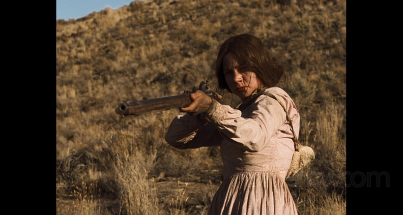
The boxier 4:3 frame is more intimate and—I’d argue—more human. Part of this is practical. Humans are vertical. Any medium-length shot filmed in widescreen inevitably involves photographically capturing additional space the human does not occupy. Meanwhile, humans tend to fill a 4:3 frame quite comfortably, like a hat in a hatbox. Here, the human being is the landscape being photographed.

Again, this isn’t a value judgment. But film is a visual medium. How filmmakers deploy their visual information matters. For example: let’s say that the general theme of the movie you’re about to make is “emotional alienation”. Same actor, same location, same music, same expression on the actor’s face—under identical circumstances, the widescreen frame will interpret “emotional alienation” as a feeling of isolation; the character is at sea in their surroundings. The 4:3 frame, however, will interpret “emotional alienation” as a feeling of claustrophobia.
Based on the two scenarios described above, it’s up to the filmmakers to decide (through clarifying their intentions) which approach will make the most sense for their particular story—isolation or claustrophobia? What is the film really about?
Now, all this isn’t to say that there haven’t been some great 4:3 Academy format films made in recent years. Gus Van Sant’s Death Trilogy (Gerry, Elephant and Last Days) used the format’s CD-jewel-case dimensions to powerful effect, as did Kelly Reichardt’s Kubrickian 2011 neo-Western Meek’s Cutoff. But more often the format tends to make metaphysical cameos in era-specific scenes or flashback sequences, as it does Kill Bill and The Grand Budapest Hotel.

Maybe 4:3 will make a comeback. More likely, the next step in the evolution of the modern picture frame—especially as influenced by text-tapping Millennials—will be 4:5, which has already been used to great effect in music videos like Kendrick Lamar’s “King Kunta”. 4:5 is even skinnier than the Academy format—4:3 on Dexatrim.
4:5 is also, it should be said, the current default size of Instagram. And what is social media, really, if not TV 2.0? Social media driving formal innovation? Why not? Cinema’s reaction to competing forms of digital entertainment is part of what pushes the medium forward. So the next time you’re thinking, how do I want my movie to look? try thinking tall, not wide.
To learn more about Film Independent, subscribe to our YouTube channel or follow us on Twitter and Facebook. You can read the rest of our blog here. To learn how to become a Member of Film Independent, just click here.
