From the Archives: Behind the Scenes (Literally) with Art Director Jennifer Dehgan
NOTE: The below piece originally ran in August of 2019. We’re re-posting it here with minor edits to the original text. Special thanks to author Su Fang Tham (and Jennifer Dehgan).
***
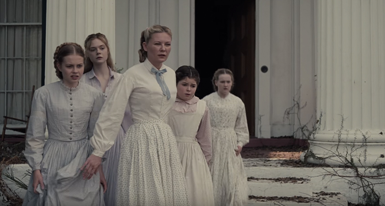
A multiple-time Film Independent Spirit Award winner for 2004’s Lost In Translation, indie favorite Sofia Coppola’s most recent directorial effort was 2017’s The Beguiled—a female-focused reimagining of the cult-favorite 1971 Western starring Clint Eastwood. In the remake (for which Coppola won Best Director at Cannes), Nicole Kidman leads an all-star cast as the austere headmistress of a Civil War era girls’ school in the South, where a group of young women have been holed up for the duration the conflict.
Trapped without any contact with the outside world, the women aren’t quite equipped to handle it when a handsome, injured Union Army soldier—Corporal John McBurney (Colin Farrell)—stumbles into their cloistered world begging for help. In creating the decaying, dreamlike look of the film, the responsibility of transforming a pristinely manicured estate in contemporary New Orleans into The Beguiled’s dilapidated schoolhouse fell to Art Director Jennifer Dehghan and her team of talented craftspeople.
Looking ahead to Dehghan’s upcoming re-teaming with Coppola for next year’s much anticipated On the Rocks, we took a deep-dive with the art director to learn more about creating the physical environment of The Beguiled’s unique Southern-Gothic setting.
JENNIFER DEHGHAN

You have a robust career outside of features, including commercials, TV and creating your own elegant and charming oil paintings!
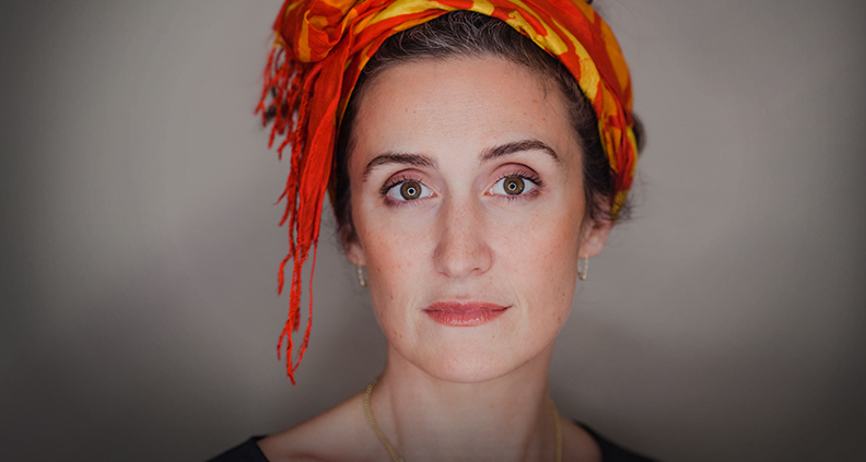
Dehghan: That’s very kind of you, thank you. At 40-years-old, I may have finally found the sweet spot where these two passions converge—painting and filmmaking. I started a gallery, Circudo, for artists to license their work to film productions so that production designers can access high quality art for their sets. Unlike prop houses and typical galleries, we want our artists to receive the compensation that they deserve.
Can you tell us how you transitioned from being an art director at the ad agency BBDO to working in film?
Dehghan: I actually stumbled onto filmmaking in a bar at JFK Airport while waiting for a flight to LA. I ended up sitting next to a brilliant documentary director/editor, who turned out to be Tom Donahue (Casting By, Thank You for Your Service.) We were both in advertising, but completely disillusioned and searching for an afterlife. [After we talked] I ended up designing his short film, Thanksgiving, in 2005.
How did your previous work in advertising inform your creative process in film? What sort of training did you have?
Dehghan: My degree was in Art Direction for Advertising Design, Applied Photography and Graphic Design. Even though it wasn’t a filmmaking degree, it couldn’t have set me up better to becoming a filmmaker. It taught me the crucial concept that every idea must have relevance and communicate an intended meaning. So you can get as abstract and nonlinear as you like, but only if the essence of that absurdist idea is relevant to the concept, whether that be an advertising slogan or—in the case of filmmaking—the truth of a character or storyline.

“Production Designer” is often used interchangeably with “Art Director.” Can you talk about the difference?
Dehghan: The production designer’s mission is to set the goals and communicate both the visual look and guttural mood—agreed upon with the project’s director and DP—then stand back a bit to maintain perspective and not get muddled in the machinery. If there’s trust and good communication between the designer and art director/set decorator, it’s just a matter of tweaking, but ideally not reworking anything. The art director’s mission is to create a network of artists and craftsmen, gather the troops and lay inroads to the intended design, then methodically collaborate with all the different crew members to make sure everything fits into the big picture precisely. So it’s a lot of communication between departments, samples and approvals and experiments, all the while keeping things on schedule and on budget.
Had you seen Don Siegel’s 1971 The Beguiled by the time you read Coppola’s script? Which aspects of the story struck you the most?
Dehghan: I hadn’t seen it. And I didn’t want to, because Sofia said specifically she was not doing a remake and I didn’t want to taint the waters in my brain. When I first read Sofia’s script it was the quiet tension, the claustrophobic feel and the concurrent trepidation/exhilaration once the injured soldier arrives that really pulled me in.
How do you normally break down a script when you first tackle it?
Dehghan: I think of it like filling a jar with rocks. First I start with the stones—basic story arc, character transitions, timeline of the story and general color palette. Then I move to the pebbles which are the actual scripted sets, interiors and exteriors, and all the set decor, props, graphics, construction/scenic work, greens, clearances, etc. that are written on the page or that I can deduce from my experience. Finally, we get to the sand—the really fun part—which is all of the heavy research on time period, socio- economic status, cultural details, environment, the psychology of the characters and the color palette. What I compile in the end is like a “Bible” for the art department to follow. I do this whether I’m designing or art directing.
How long was pre-production for your team on The Beguiled?
Dehghan: I had six weeks of prep, which was manageable because Anne and Sofia had done such thorough prep and research beforehand. As soon as I landed in New Orleans, Anne took Amy Silver, the decorator, and me out to the plantation house that served as our Exterior, Grounds, Blacksmith Shop, Slaves’ Kitchen and Dining Room. She showed us all around and talked about their ideas, while Phillippe LeSourd—the DP—shot still photos. Amy and I had already seen all of Anne’s reference images, so as we surveyed the grounds she recalled for us which reference applied to which space or scene. When Sofia arrived in town, we had a department head read-through of the script and she talked about the essence of the story she wanted to tell.
How did your team transform a perfectly manicured plantation estate in modern day New Orleans to a crumbling façade of a Civil War era girls’ school with Southern Gothic vibes?
Dehghan: The grounds and the exterior Plantation House were my main undertaking. We had to transform a manicured lawn of trim green grass into an overgrown, crumbling, claustrophobic floating world. We wound vines up the façade, we felled trees and branches and inserted countless sticks and weeds into the ground. We dried up the lawn and added debris and dirt to dull it down. To obstruct the views and “trap” the women within the house, we created period-specific vegetable and flower gardens and built long runs of handmade fences from planks and woven sticks. We also wanted to hide the clear blue sky and give the feeling that even fresh air had no way in, so we hung moss from the trees all around. Our lead greensman, Russ Doyle, was an amazing artist and collaborator, so between Russ and Jason Oertling (Charge Scenic), Chuck Stringer (Construction Coordinator) and Alice Alward (Asst. Art Director), I was spoiled with talent and grace. I would be lucky to get to work with them again. They made me look better than I am.

What advice would you have for aspiring art directors or production designers?
Dehghan: With the long hours and constantly working on location, it can be a grind and take a toll on your family. As a woman, you must be prepared for the recurring rejection which has nothing to do with your ability to design a film, like not getting a job because you’re pregnant and so on. You need to love it enough to never leave and try and change it for the better. I keep coming back for it and I can’t imagine doing anything else!
Is there a specific production designer whose work you especially admire?
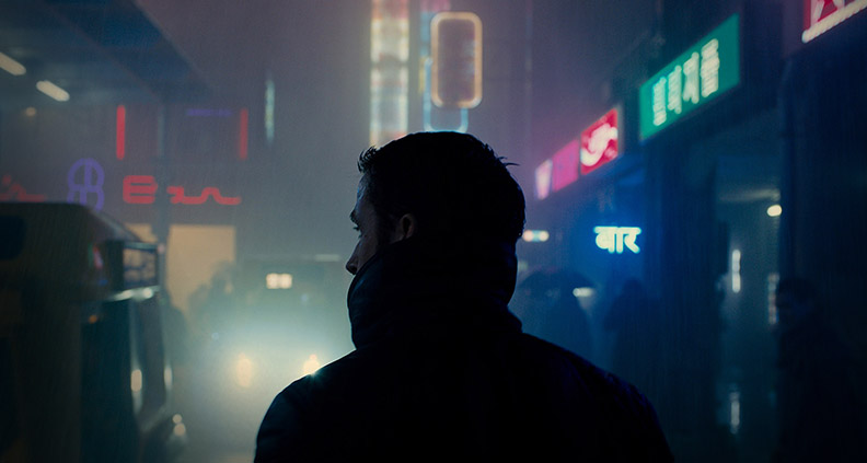
Dehghan: Dennis Gassner just blows my mind—I didn’t want Blade Runner 2049 to ever end. And Spectre is a masterpiece that has life imitating art on a grand scale. Did you know that Mexico City now holds an El Día de los Muertos parade just because after the world saw the parade Gassner designed for Spectre, tourists started coming in droves looking for it? Amazing! Jim Clay will never fall from the heights of Children of Men for me, just as Andrew McAlpine is my hero for The Piano.
When can we see your work on the big screen next?
Dehghan: I’ve just finished working on Sofia Coppola’s On The Rocks, which was shot in New York and Mexico. I’m also an associate producer on The Night, which is in post right now—it’s a thriller and the first Iranian film shot in Hollywood, helmed by Iranian-American filmmaker Kouroush Ahari (The Yellow Wallpaper.)
Film Independent promotes unique independent voices by helping filmmakers create and advance new work. To become a Member of Film Independent, just click here. To support us with a donation, click here.
More Film Independent…
(Header: The Beguiled)
